Another Approach to Book Marketing
Creating the Bridge Across the Ocean Website, Part I
Book marketing is tough. Authors are skilled at writing books yet we’re now saddled with managing the entire process, from ideation to fulfillment and beyond. While word of mouth remains (IMO) the most effective way to market a book, there are some other good if not unconventional ways. Maybe it’s because I’m left-handed, but I’m trying a left-handed way to introduce readers to Bridge Across the Ocean. It’s the book’s website.
Everybody tells authors they need to have a website. I recently attended a street book fair where only about half the authors I spoke with had websites. I encouraged them to get on the stick.
Visiting authors’ websites should go hand in hand with reading and studying their books for tips on how to write and market themselves. But for this post readers, not authors, are my target audience. Simply put, I’m sharing my website-building experience to help you garner interest in your book.
The website is for Bridge. Over the next few weeks I’m going to walk you through it, so let’s get started by opening it in your browser.
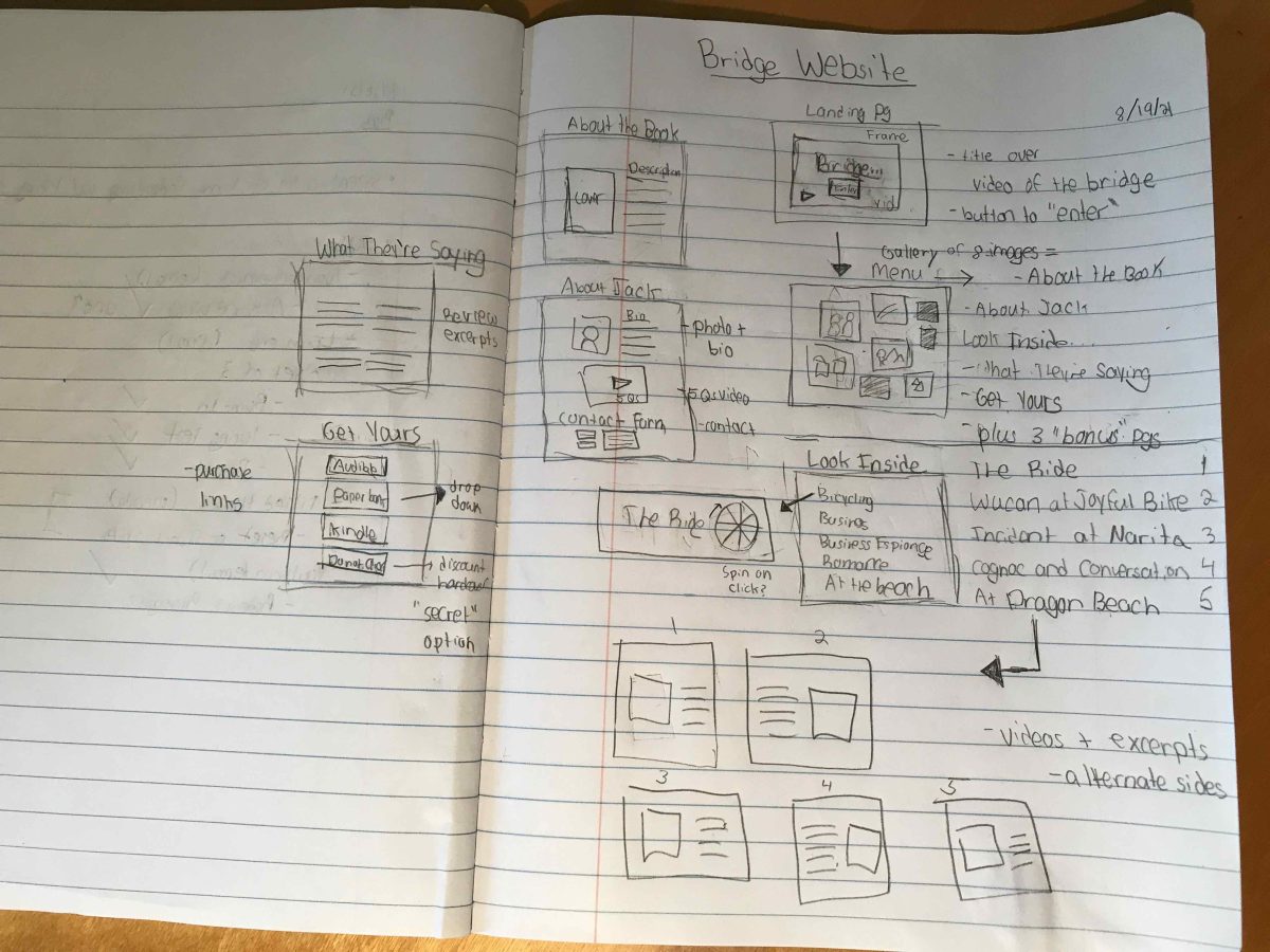
I played a guiding hand in conceptualizing the Bridge website, but all the credit for designing and building it goes to other talented, creative people. The initial website design was created by Tori Merkle, my Associate Editor at Joshua Tree Interactive. Tori and I discussed the site’s proposed content and purpose and how best to convey both so as to interest people in reading my book. Tori set to work with pencil and paper to create the website map, while I sat watching in amazement:

We then turned to Melanie Marston, the creative director of Marston Creative (and who doesn’t mind being called Mel) for technical guidance and execution. Mel, Tori and I conferred on Zoom several times, intent on making the website as distinctive as the book itself. Mel turned Tori’s drawing into Web code and it went through a few revisions until all three of us were, well, excited.
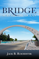
Earlier I had explained to Mel how I had come to name my novel, mentioning the actual bike ride I’d taken across this real and metaphorical Penghu Great Bridge. Mel used the photo I had taken, which produced both the title and book cover design. So I told her a video of the bridge was what I wanted on the website landing page. Unfortunately, I had shot no video. Fortunately, I had a friend in the Penghu Islands and his daughter, Isabel Peat, shot the video (see her videographer credit at the bottom). She captured this footage of a cyclist riding through the arch and onto the bridge. Way to go, Isabel!
Next week: Developing visual and graphic design enhancements for our static web page layouts


