Innovation in Website Design, Defined
My mother, Jacqueline Smith Rochester, was an exceptional artist in every aspect of her life. When she graduated high school, my grandfather sent her to art college in Washington, D.C. That was money well spent.
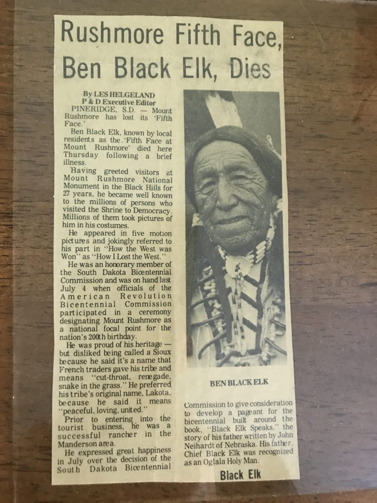
She held a lifelong fascination for our Indigenous community with whom we lived in South Dakota (we called them Sioux Indians, and later Lakota), drawing and painting them in their everyday lives again and again. Perhaps most famously—if I can use that term in moderation—was her charcoal rendering of Ben Black Elk. More on this subject next week.

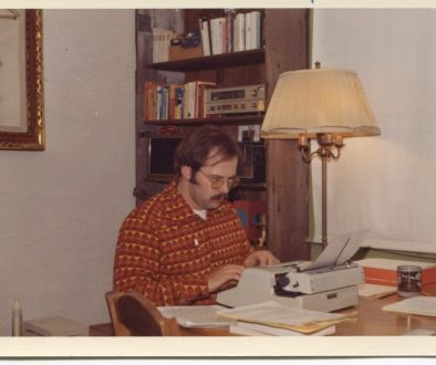
For me, creativity was always about writing, but I admired my mother’s art; I just didn’t think I had it in me. So it came as a surprise as I was writing my first college textbook when the publisher’s art director asked me to provide sketches of the illustrations I wanted. They could be simple, “roughs,” intended only to convey the idea and purpose so a professional graphic designer could render them as art for the book. At first I balked, but once I got into it, it became fun.
I sketched interior art for my next textbook too, including trying to use less conventional renderings of charts and graphs that would convey information better. I designed the entire book’s interior for my third textbook to resemble website pages. Once I began writing novels, I worked with more graphic artists and cover designers, such as Melanie Marston, who designed the covers for Anarchy and Bridge Across the Ocean.
Melanie, who doesn’t mind being called Mel, runs Marston Creative, where she builds and maintains websites for customers. She and I have worked together on my websites for longer than my email messages can count. Her previous tour de force was JackBoston, and now she’s topped that—boy oh boy has she ever—with the Bridge Across the Ocean website.

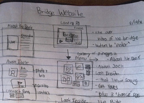
The initial website design (above) was created by Tori Merkle, my associate editor at Joshua Tree Interactive. Tori and I discussed the content and purpose, and how best to convey both to interest people in reading the book. Tori set to work with a pencil to make the website map, then Mel, Tori and I conferred on Zoom several times, intent on making the website as distinctive as the book itself. When you open the link, the first thing you’ll see is a video of the Penghu Great Bridge, shot for me by Isabel Peat, because most of this novel takes place in Taiwan. And since this is a novel about bicycling, almost immediately you’ll see a cyclist ride through the arch. Way to go, Isabel!
The next mouse click takes you to the home page where you’ll see photos, styled after Polaroids, pinned on a corkboard to convey travel pictures; most are scenes in Taiwan. Explore them to learn more about my novel, but don’t miss clicking on “Look Inside” where you’ll be able to read some excerpts and watch some accompanying very cool vectorized black-and-white videos. Each was rendered from actual videos and stills I shot (I’ve been to Taiwan five times). These animations (and the one of me on “About Jack”) were created by Washim Seeraaz and his team at The Sketchy Business in Kolkata, India (I found them on Fiverr).
I was exceedingly fortunate to have seventeen authors, editors and subject matter experts read the book and write book reviews—each finding something of interest in particular, all of the complimentary. Several said reading about Taiwan stimulated an interest in traveling there! You can read all these editorial reviews on the “What They’re Sayin” page (and in short form on the book’s Amazon page). Although it’s only been three weeks since publication, I’ve received messages from three people who liked the website enough to buy the book.
I loved working with these talented creative people, each of whom made a significant contribution to building this extraordinary website. I appreciate the reviewers’ kind and thoughtful comments more than I can adequately express. Thank you, one and all.


